
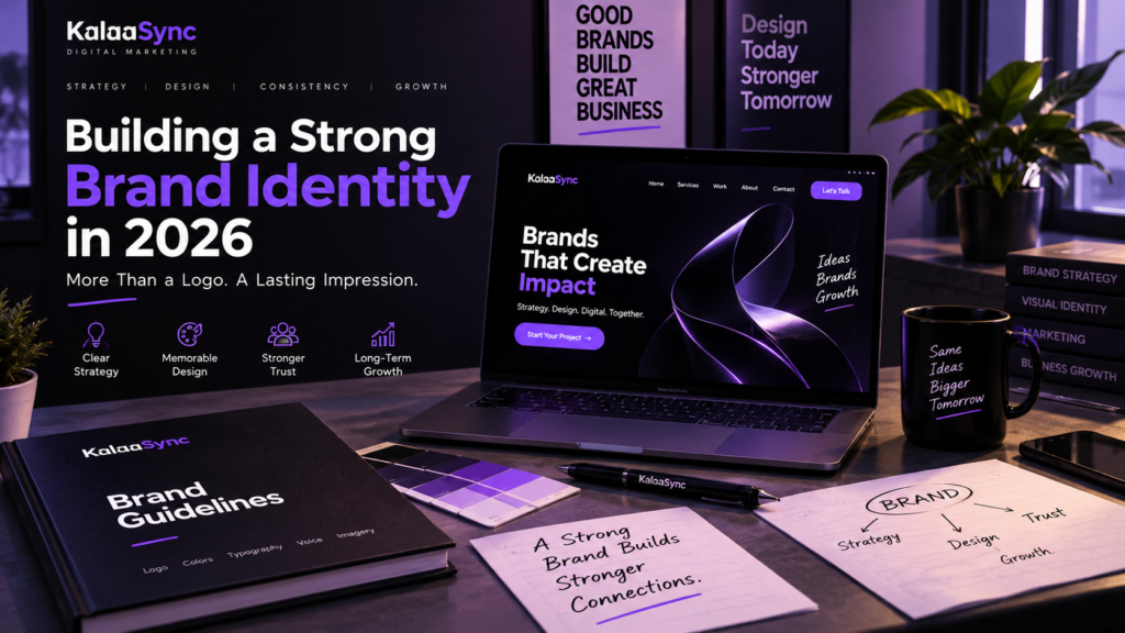
A strong brand identity is about much more than having a good-looking logo.
Your brand identity is how people recognize your business, understand what you stand for and experience your business across different channels. Your website, social media, packaging, advertisements, emails and even the way you write can all contribute to that experience.
In 2026, this matters even more because customers interact with brands across more platforms and formats than ever. Your business might appear on Instagram in the morning, Google in the afternoon and WhatsApp in the evening.
So, your branding needs to feel connected everywhere.
A strong identity does not mean making everything look identical. Instead, it means creating a clear system that gives your business a recognizable personality while still allowing your content to adapt to different platforms.
In this guide, we’ll break down what brand identity really means, which elements you need, how to create consistent branding and how to keep your identity relevant as your business grows.
What Is Brand Identity?
Brand identity is the collection of visual and verbal elements a business uses to present itself to its audience.
This includes your logo, colors, typography, imagery, messaging, tone of voice and overall design style.
However, brand identity is different from brand perception.
Brand identity is what your business intentionally creates.
Brand perception is how people actually see and remember your business.
The goal is to make those two things as closely aligned as possible.
Brand Identity vs Brand Strategy
Your brand strategy provides the direction behind your identity.
It answers questions such as:
- Who are we trying to reach?
- What problem do we solve?
- What makes us different?
- What should customers associate with us?
- How should the brand feel?
- What position do we want to occupy in the market?
Your visual identity then turns those strategic decisions into something people can see and recognize.
As a result, good branding starts with strategy rather than simply opening a design tool and creating a logo.
Adobe describes brand guides as a blueprint that helps keep visual and verbal elements consistent across a brand experience.
Logo and Visual Identity Design
Your logo is an important part of your identity, but it should not carry the entire brand.
A complete brand identity design creates a visual system that works across different situations.
Logo Design
A good logo should be recognizable and practical.
It may need to work on:
- Websites
- Social media profiles
- Business cards
- Packaging
- Signage
- Advertisements
- Documents
- Mobile screens
Therefore, a logo should have appropriate variations for different applications.
You may need a primary logo, secondary version, icon or simplified mark.
Photography and Graphic Style
Your visual identity also includes the type of images and graphics you use.
For example, a luxury brand might use controlled lighting, spacious layouts and refined photography. A fitness brand could use energetic photography, stronger contrast and dynamic compositions.
The important part is that these choices support the personality of the brand.
HubSpot describes visual identity systems as broader than logos, including elements such as color, typography, photography, video and other visual components.
Choosing Brand Colors and Fonts
Colors and typography can quickly change how a business feels.
However, choosing them should be more strategic than simply picking your favorite colors.
Build a Practical Color Palette
Start with a primary brand color.
Then, add supporting colors that work with it.
A basic system could include:
- Primary color
- Secondary color
- Accent color
- Background colors
- Text colors
You should also define where each color should be used.
For example, your primary color might be reserved for important brand elements, while neutral colors handle most of your website background and text.
This makes your visual identity easier to control.
Choose Typography Carefully
Typography affects both personality and usability.
A modern technology company might use a clean sans-serif typeface. Meanwhile, a premium fashion brand may use a serif font for selected headings.
The key is consistency.
Define which fonts are used for:
- Main headings
- Subheadings
- Body copy
- Buttons
- Captions
- Special brand accents
Adobe’s current brand-guideline guidance also highlights typography, logo variations, color palettes, imagery and voice as important components of a brand guide.
Brand Voice and Messaging
A brand should not only look consistent.
It should also sound consistent.
Your brand voice is the personality behind your written communication.
For example, a business might want to sound:
- Professional
- Friendly
- Confident
- Helpful
- Bold
- Minimal
- Playful
Choose a few characteristics that actually fit your audience and positioning.
Create Clear Messaging
Start by defining your core message.
Ask:
What do we do?
Explain your offering simply.
Who do we help?
Define your primary audience.
Why should they care?
Explain the value you provide.
Why should they remember us?
Identify what makes your business distinctive.
From there, create messaging that can be adapted for your website, advertisements, social media and sales communication.
Make Your Voice Usable
Avoid guidelines such as:
“Always sound cool.”
That is too vague.
Instead, define practical rules.
For example:
We are: Clear, confident and helpful.
We are not: Aggressive, complicated or overly corporate.
This makes your brand voice easier for writers, designers and marketing teams to follow.
Mailchimp also recommends documenting voice, tone, typography, colors and logos within a brand style guide to maintain consistency.
Keep Your Brand Consistent Across Every Channel
A strong visual identity should work wherever customers encounter your business.
That includes:
- Website
- Google Business Profile
- Advertisements
- Packaging
- Printed materials
- Presentations
- Sales documents
The experience does not need to be identical on every platform.
Instead, the recognizable elements should remain connected.
Create Brand Guidelines
This is where brand guidelines become useful.
Your guidelines can document:
- Logo usage
- Clear space
- Color codes
- Typography
- Photography style
- Icon style
- Graphic elements
- Brand voice
- Messaging rules
- Social media examples
- Do’s and don’ts
Think of the document as a reference point for everyone working on the brand.
So, when a new designer creates an Instagram post six months later, they do not have to guess which purple, font or logo version to use.
Adobe similarly describes brand style guides as a rulebook for visual and written communication across channels.
Audit Your Brand Regularly
Consistency can become difficult as your business grows.
New employees create new content. Different agencies produce campaigns. Social media trends change. New products are launched.
As a result, small inconsistencies can appear over time.
A simple brand audit can help.
Review your website, social profiles, advertisements, emails and printed materials. Then ask:
- Does everything look like the same company?
- Is the logo being used correctly?
- Are colors consistent?
- Does the tone sound consistent?
- Are the same key messages being repeated?
- Does the brand still match the audience?
Mailchimp recommends organizing brand assets and making approved materials accessible to the people who need them.
How to Evolve Your Brand Without Losing Its Identity
Your business will change. Audience may change. Your products may expand. Your website may be redesigned. New platforms may become important.
That does not mean you need to completely rebrand every few years.
Instead, evolve your identity carefully.
Keep the Core, Update the System
Your core brand elements might remain stable while your execution becomes more modern.
For example, you might keep:
- Your brand name
- Core colors
- Logo concept
- Brand personality
- Positioning
At the same time, you could update:
- Website layouts
- Photography
- Social templates
- Motion graphics
- Content formats
- Campaign styles
This approach gives the brand room to grow without making it unrecognizable.
Adobe’s current guidance also emphasizes that consistent branding does not mean staying static; brand systems can evolve as businesses, products and audiences change.
Common Brand Identity Mistakes
Even businesses that invest heavily in design can make basic branding mistakes.
1. Designing Only a Logo
A logo alone does not create a complete brand.
You need a broader visual and verbal system.
2. Using Too Many Fonts
Different fonts everywhere can make your brand feel inconsistent.
Choose a small, practical type system instead.
3. Changing Colors Constantly
Using slightly different shades across every design makes your identity harder to recognize.
Define exact color values and stick to them.
4. Copying Competitors
Researching competitors is useful.
Copying their identity is not.
Your branding should communicate your own positioning and personality.
5. Ignoring Brand Voice
A company can have excellent visuals but confusing communication.
If your website sounds professional but your social media sounds completely different, the overall experience can feel disconnected.
6. Creating Guidelines Nobody Uses
A beautiful PDF is not enough.
Your guidelines need to be practical and accessible so designers, marketers and other teams can actually use them.
How to Build Your Brand Identity in 2026
You do not need to create everything at once.
Start with a simple process.
Step 1: Define Your Brand Strategy
Understand your audience, positioning, values and differentiation.
Step 2: Create Your Visual Direction
Develop your logo, colors, typography, imagery and graphic style.
Step 3: Define Your Voice
Decide how your brand communicates and create examples of what to say and what to avoid.
Step 4: Build Your Brand Guidelines
Document the rules so the identity can be used consistently.
Step 5: Apply It Everywhere
Bring the identity into your website, social media, advertisements, packaging, emails and other customer touchpoints.
Step 6: Review and Improve
Finally, review the brand as your business evolves.
A strong identity should provide structure without becoming a limitation.
Final Thoughts
A strong brand identity is not simply about looking professional.
It gives your business a recognizable visual language, a consistent voice and a clear way to communicate with customers.
Your logo is only one part of that system. Colors, typography, imagery, messaging, tone and brand guidelines all work together to create the complete experience.
So, instead of asking, “Does my logo look good?”, ask a bigger question:
“Does everything my business puts into the world feel like the same brand?”
If the answer is no, it may be time to build a stronger system.
At KalaaSync, we combine brand strategy, creative design and digital execution to help businesses create a more consistent digital presence.